What is Data Storytelling? 🎨📊
Welcome to the exciting world of data storytelling! Imagine being able to turn a mountain of data into a captivating story that not only engages your audience but also drives important decisions. Let’s dive into this magical fusion of data, visuals, and narrative that can transform your presentations from mundane to mesmerizing.
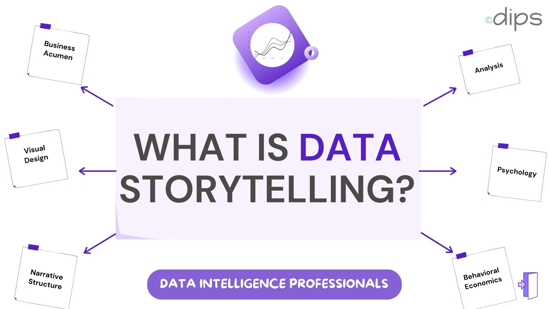
Data storytelling is the practice of combining data, visualizations, and narrative techniques to create a story that communicates insights effectively and drives decision-making. It’s an essential skill for data analysts, scientists, and business professionals who aim to transform data into meaningful stories.
Data storytelling is the practice of combining data, visualizations, and narrative techniques to create a story that communicates insights effectively and drives decision-making. It’s an essential skill for data analysts, scientists, and business professionals who aim to transform data into meaningful stories.
THE COMPONENTS OF DATA STORYTELLING
-
Data: Think of data as the raw ingredients of your story. This involves collecting, cleaning, and analyzing data to uncover trends, patterns, and insights. 🥦🍅🍋
-
Visualizations: Visuals are like the spices that make your story flavorful. They include charts, graphs, and other visual aids that transform complex data into something more accessible and understandable. 🌶️📉📊
-
Narrative: This is the heart and soul of your data story. A narrative provides context, highlights the significance of the data, and guides the audience through the insights in an engaging manner. 📜💡
WHY IS DATA STORYTELLING IMPORTANT?
-
Enhances Understanding: Raw data can be as confusing as trying to read a book in a foreign language. Data storytelling simplifies complex information, making it easier for audiences to grasp the main points. 🧠📘
-
Engages the Audience: Stories captivate us. By framing data within a narrative, you can capture your audience’s attention and keep them engaged. 🎥👀
-
Drives Action: A compelling data story can influence decision-making. By presenting data in a persuasive way, you can motivate stakeholders to take action based on the insights presented. 🚀💼
STEPS TO CREATE A DATA STORY
1. DEFINE YOUR PURPOSE
Start with the end in mind. What do you want to achieve? Who is your audience? What action do you want them to take? Being clear about your objective will guide the entire storytelling process.
Example: If you’re a marketing analyst, your purpose might be to show how a recent social media campaign has increased website traffic and sales.
2. COLLECT AND ANALYZE DATA
Gather your data from reliable sources and dive deep into analysis to uncover the insights that will power your story. Clean your data to remove any inconsistencies or errors.
Example: Pull data from Google Analytics, sales reports, and social media metrics. Analyze the data to find trends and patterns that support your story.
3. CHOOSE THE RIGHT VISUALIZATIONS
Pick visualizations that best represent your data. Think of this as selecting the right tools for the job. Different types of data and insights require different visual representations.
Example: Use a line chart to show trends over time, a bar chart for comparing quantities, or a pie chart to illustrate proportions.
4. CRAFT YOUR NARRATIVE
Develop a storyline that ties your data and visualizations together. Provide context, explain the significance, and guide your audience through the insights. Your narrative should have a clear beginning, middle, and end.
Example: Begin with the context of the marketing campaign, highlight the key metrics showing its success, and conclude with recommendations for future campaigns.
5. ITERATE AND REFINE
Review your data story and get feedback. Ensure it’s clear, compelling, and free of any confusing elements. Make adjustments as needed to improve clarity and impact.
Example: Present your draft to a colleague and ask for feedback. Simplify complex visualizations or add explanatory notes where needed.
BEST PRACTICES FOR DATA STORYTELLING
-
Know Your Audience: Tailor your story to the knowledge level and interests of your audience. What works for data scientists may not work for business executives. 🧑🔬👔
-
Focus on Clarity: Avoid clutter and ensure your visualizations are easy to understand. Use labels, legends, and annotations to clarify key points. 🔍🖊️
-
Be Concise: Get to the point quickly. Highlight the most important insights and avoid overwhelming your audience with too much information. 🕒📉
-
Use a Consistent Style: Maintain a consistent visual and narrative style throughout your story. This helps to create a cohesive and professional presentation. 🎨📏
-
Incorporate Real-World Examples: Relate your data to scenarios your audience can relate to. This adds relevance and makes your story more impactful. 🌍💬
PRACTICAL TIPS FOR EFFECTIVE DATA STORYTELLING
START WITH A HOOK
Just like any good story, your data story should start with a hook that grabs your audience’s attention. This could be a surprising statistic, a compelling question, or a striking visual.
Example: “Did you know that our latest social media campaign doubled our website traffic in just one week?”
USE ANALOGIES AND METAPHORS
Analogies and metaphors can help make complex data more relatable and easier to understand.
Example: “Think of our customer journey like a funnel. At the top, we attract a wide audience, but only a smaller number make it through to a purchase at the bottom.”
HIGHLIGHT KEY INSIGHTS
Don’t make your audience work to find the insights. Highlight the most important points clearly and explicitly.
Example: Use callouts or highlight key figures in your visualizations to draw attention to the most important data points.
TELL A COMPLETE STORY
Ensure your data story has a clear beginning, middle, and end. Introduce the context, present the data and insights, and conclude with a summary and recommendations.
Example: Begin with the objective of the analysis, present the findings in a logical sequence, and conclude with actionable recommendations.
A FUN EXAMPLE: TELLING A STORY WITH PIZZA DATA 🍕
Imagine you’re a pizza shop owner who wants to tell a story about your sales data:
PURPOSE
You want to show how sales have increased since introducing a new pizza flavor.
DATA
You collect sales data from the past year, customer feedback, and social media engagement metrics.
VISUALIZATIONS
- Line Chart: Show the trend of sales over time, with a highlight where the new flavor was introduced.
- Pie Chart: Illustrate the proportion of sales coming from different pizza flavors.
- Bar Chart: Compare customer satisfaction ratings before and after the new flavor was introduced.
NARRATIVE
- Beginning: Introduce the challenge—sales were stagnating, and you needed a new strategy to boost them.
- Middle: Present the data showing the increase in sales after introducing the new flavor. Include customer feedback quotes to make it personal.
- End: Summarize the success and recommend introducing more new flavors based on customer preferences.
REFINE
Review your story for clarity and impact. Add annotations to your charts explaining key points, and ensure your narrative flows smoothly from one point to the next.
CONCLUSION
Data storytelling is an art that transforms data from dry numbers into engaging stories that resonate with your audience. By combining data, visualizations, and narrative, you can create compelling stories that enhance understanding, engage your audience, and drive action. Whether you are a data analyst presenting findings to your team or a business professional making a case to stakeholders, mastering the art of data storytelling is essential for effective communication in the modern world.
So, next time you have a pile of data, think of it as a treasure trove of stories waiting to be told! 📊✨
Now go out there and start telling your data stories! 🚀📖